For Teams: Build Role Based CRM Dashboards in 5 Steps Without Code

A CRM dashboard is a role-based visual workspace that pulls together the customer and sales data a team needs to act fast. It replaces scattered spreadsheets and static reports with live charts, gauges, and lists that salespeople, marketers, and support agents check daily. A typical example is a pipeline-value gauge that tells a sales rep exactly how close they are to quota.
TL;DR:
- Limit each dashboard to five to seven primary metrics, give every metric a named owner, and review sales measures weekly and executive views monthly.
- Show the reporting period and freshness timestamp, because widgets may update immediately, every few hours, or once daily depending on their data source.
- Give each role its own view: sales needs pipeline, quota, open deals, and follow ups, while support tracks ticket backlogs, SLA breaches, and agent workload.
- Use a CRM dashboard for daily decisions, but choose a BI tool when analysis must combine CRM data with finance, product usage, or other systems.
Table of Contents
- What makes something a CRM dashboard, not just a report
- How CRM dashboards work: data, refresh, and interaction
- Key CRM dashboard features teams actually use
- Which CRM metrics actually belong on a dashboard
- Design rules that keep dashboards from turning into clutter
- Sales, marketing, and customer service dashboard examples
- What teams actually gain from using CRM dashboards
- When a CRM dashboard is enough, and when you need BI
- Building role-based dashboards without writing code
- What actually determines whether a dashboard gets used
- SoftEXIT CRM: a practical no-code path to role-based dashboards
- FAQ
- Sources
What makes something a CRM dashboard, not just a report
A report tells you what happened. A dashboard shows you what is happening now, and lets you act on it. The distinction matters because many teams confuse the two, then wonder why their “dashboard” sits unopened in a shared folder.
Business intelligence (BI) tools like Tableau or Power BI pull data from many systems for deep, cross-functional analysis. A CRM dashboard stays closer to the ground: it lives inside the CRM, reflects the records your team already touches, and is built for daily operational decisions rather than quarterly strategy reviews.
Good CRM dashboards are also role-based. A sales rep needs their own open deals and next actions. A support manager needs ticket backlogs and service-level breaches. A marketing lead needs funnel conversion and campaign spend. One dashboard rarely serves all three.
What separates a usable dashboard from a wall of charts:
- Filters that let a user narrow data by date, owner, or stage without rebuilding the view.
- Drill-downs that take a user from a summary chart straight to the underlying records.
- Direct links from a chart or table row into the actual CRM record.
How CRM dashboards work: data, refresh, and interaction
Dashboard numbers come from somewhere specific, and knowing the source matters when a figure looks off. Most CRM dashboards draw from CRM objects (contacts, companies, opportunities, tickets), supplemented by email logs, call records, marketing automation platforms, and sometimes an imported spreadsheet for data that has not yet been migrated.
Refresh speed varies by widget and by system. Some data updates the moment a record is saved. Other widgets run on a schedule, pulling fresh numbers every few hours or once a day. Either way, a trustworthy dashboard shows an “as of” timestamp so nobody mistakes a stale snapshot for a live count.
Interactivity is what turns a static chart into a working tool:
- Click a bar in a pipeline chart to see the exact deals behind it.
- Apply a filter for your own territory or team without IT involvement.
- Save a custom view so your filtered version reopens exactly as you left it.
- Jump directly from a dashboard tile into the full CRM record to update it.
This combination, current data plus the ability to click into it, is what separates an interactive dashboard from a PDF someone emails around on Mondays.
Key CRM dashboard features teams actually use
A dashboard earns its place on someone’s home screen by covering a short list of practical capabilities, not by looking impressive in a demo.
- Trend charts and funnel visualizations that show pipeline movement and conversion by stage over time.
- Gauge tiles that compare actuals to quota or target at a glance.
- Leaderboards that rank reps or teams by closed revenue or activity volume.
- Activity tables listing recent calls, emails, and meetings tied to specific deals.
- Next-action lists that surface overdue tasks or deals needing follow-up.
- Scheduled alerts and exports that push a summary to email or flag a threshold breach.
- Role-based views and permissions so each user sees their own data, with managers able to see team or company-wide rollups.
- Mobile and responsive layouts so a dashboard built on a desktop still reads cleanly on a phone between meetings.
None of these require custom software. Dashboard templates built on the SalesforceLabs CRM dashboards repository show exactly this pattern: pipeline growth charts, an open-deals table, a leaderboard, and a quota-versus-actual gauge, assembled from standard widgets rather than one-off engineering.
Which CRM metrics actually belong on a dashboard
The right KPIs depend on the team, but a few show up on nearly every useful sales or service dashboard.
- Pipeline value and stage counts show how much revenue is in motion and where deals are stuck.
- Conversion rate by stage, win rate, and average deal size reveal whether the pipeline is healthy or just big.
- Activity metrics such as calls made, meetings held, emails sent, and tasks completed connect effort to outcomes.
- Service metrics including open tickets, time to resolution, and customer satisfaction (CSAT) keep support teams accountable to response commitments.
Dashboard templates built around these metrics shorten setup time. Databox offers free CRM dashboard templates pre-configured with common sales, marketing, and executive KPIs, which gives teams a working layout to adapt instead of a blank canvas.
Picking metrics is only half the job. Each number needs an owner, someone accountable for moving it, or it quietly becomes wallpaper.
Design rules that keep dashboards from turning into clutter
Most failed dashboards fail for the same reason: too many metrics, no clear order, and nobody responsible for acting on what they show.
Limit the primary metrics on any one dashboard to five to seven. Beyond that, a user’s eye has nowhere to land, and the dashboard stops functioning as a quick-glance tool. Best-practice KPI dashboard guidance recommends laying dashboards out as a decision sequence: context first, then diagnosis, then supporting detail, ending with assigned actions. A sales manager should be able to glance at the top of the screen for the headline number, scan down for what’s driving it, and land on a specific next step.
A few habits keep that structure intact over time:
- Always show the reporting period and a freshness timestamp so nobody mistakes last week’s numbers for today’s.
- Assign a named owner to every primary metric, and set a regular review cadence, weekly for sales, monthly for executive views.
- Retire widgets nobody clicks. A dashboard with ignored tiles is harder to read, not more complete.
- Use color sparingly, reserved for exceptions and items that need action, not as decoration on every tile.
Metrics without owners get ignored, according to the same KPI dashboard best practices guidance, which is as much a governance point as a design one.
Pro Tip: Before adding a new widget, ask who will act on it and how often. If nobody can answer, leave it off.
Sales, marketing, and customer service dashboard examples
Each team’s dashboard should look different because each team makes different decisions.
A sales dashboard typically centers on pipeline health: total pipeline value by stage, quota versus actual for the month or quarter, a table of top open deals, and a short list of next actions for each rep. Sample sales manager dashboard configurations show this exact combination: a pipeline growth chart, an open deals table, a closed-deals leaderboard, and an actuals-versus-quota gauge.
A marketing dashboard usually tracks lead sources, funnel conversion from lead to opportunity, and campaign return on investment, so a marketing lead can see which channels are actually producing pipeline rather than just traffic.
A customer service dashboard focuses on open ticket counts, service-level agreement (SLA) breaches, and agent productivity, giving a support manager an immediate read on where the team is falling behind.
A starter checklist works across all three:
| Dashboard element | Sales | Marketing | Customer service |
|---|---|---|---|
| Freshness timestamp | Yes | Yes | Yes |
| Primary chart | Pipeline by stage | Funnel conversion | Open tickets by priority |
| Comparison tile | Quota vs. actual | Spend vs. ROI | SLA breach rate |
| Detail table | Top open deals | Lead source breakdown | Agent ticket load |
| Action list | Next follow-ups | Campaigns to pause/scale | Escalations pending |
| Team | Core decision the dashboard supports |
|---|---|
| Sales | Which deals need attention this week to hit quota |
| Marketing | Which channels to fund next quarter |
| Customer service | Where to add coverage to meet SLAs |
Mapping each CRM field to a specific widget before building anything prevents the most common mistake: a dashboard full of charts that don’t connect to a decision.
What teams actually gain from using CRM dashboards
The payoff from a well-built dashboard shows up in daily behavior, not just in a quarterly report.
- Decisions move faster because reps and managers see current numbers instead of waiting for a weekly export.
- Forecasting improves when pipeline stage data is visible and current rather than reconstructed from memory at month-end.
- Activity discipline improves because reps can see their own gaps, like a quiet week of outbound calls, without a manager pointing it out.
- Cross-team alignment improves when sales, marketing, and service look at shared definitions of a lead or a deal stage instead of three separate spreadsheets.
The common thread is less reliance on ad-hoc exports and more reliance on one current source that everyone trusts.
When a CRM dashboard is enough, and when you need BI
Most day-to-day decisions, this week’s pipeline, this month’s ticket backlog, don’t need anything beyond what a CRM dashboard already shows. Reach for a dedicated BI tool only when you’re combining CRM data with finance, product usage, or other systems the CRM was never meant to hold.
Common integrations feeding CRM dashboards include email platforms, marketing automation tools, and telephony systems. For call-heavy sales or support teams, call insights and transcription data can feed directly into activity and quality metrics on a dashboard, turning call volume into a tracked KPI rather than an anecdote.
A few monitoring habits matter regardless of tool:
- Set alerts for threshold breaches, like a deal sitting untouched for two weeks.
- Schedule exports for stakeholders who need a weekly snapshot but don’t log into the CRM.
- Keep an audit log of who changed dashboard definitions and when, so metric drift gets caught early.
Building role-based dashboards without writing code
Most teams don’t need a developer or a BI license to get a working dashboard. The process starts with a decision, not a chart.
- Pick five to seven KPIs that someone will actually act on this week, not every metric the CRM can report.
- Map each CRM object (opportunities, tickets, activities) to a specific widget, and set an “as of” timestamp so freshness is visible.
- Configure filters and saved views so each role sees their own pipeline or ticket queue by default.
- Assign an owner and a review cadence for each metric, and set permissions so managers see rollups while reps see their own records.
- Test on mobile before rolling out, since many reps check dashboards between meetings rather than at a desk.
On SoftEXIT CRM, this process happens without custom development because dashboards are built directly on SoftEXIT Studio’s configurable data model. Charts, gauges, grids, and KPI-style views get assembled from existing fields and objects, so a dashboard reflects how your organization actually tracks deals rather than forcing your process into someone else’s template. My Dashboard and My Data views let a salesperson focus on their own pipeline, opportunities, activities, and tasks by default, while still reaching broader team or company data when permissions allow it. The SoftEXIT CRM walkthrough shows this configuration process in more detail.
Pro Tip: Build the sales rep’s dashboard first. If it doesn’t help them close this week’s deals, fix it before rolling out versions for other roles.
What actually determines whether a dashboard gets used
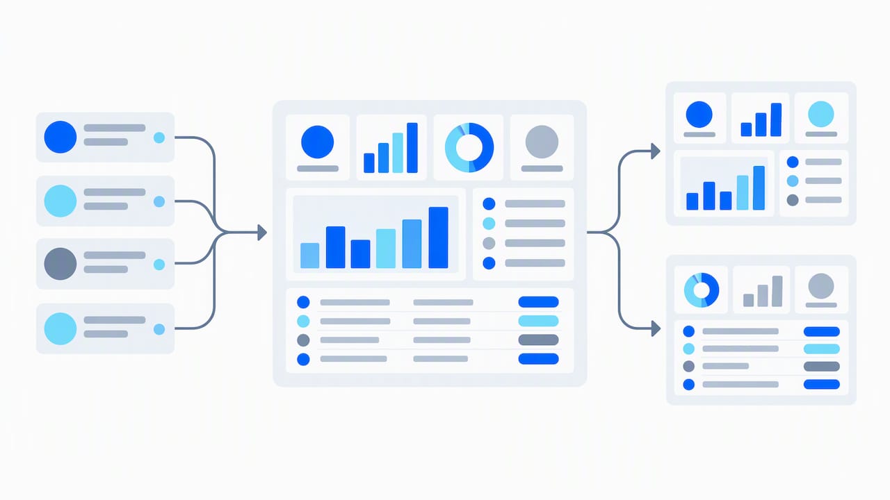
In my view, the technical build is the easy part. Most dashboards fail on governance: nobody owns the metrics, data entry habits vary by rep, and the layout never gets retired or revised. Involve sales, marketing, and support reps in the design before launch, not after adoption stalls. Measure who actually opens the dashboard each week, and cut the widgets nobody checks.
— James Edgell
SoftEXIT CRM: a practical no-code path to role-based dashboards
Most of what makes a dashboard useful, role-based views, configurable widgets, and a decision-first layout, doesn’t require a development team or a separate BI license. We built SoftEXIT CRM on SoftEXIT Studio’s configurable data model specifically so organizations can assemble charts, gauges, and grids around their own sales process instead of adapting their process to fit a fixed CRM structure.
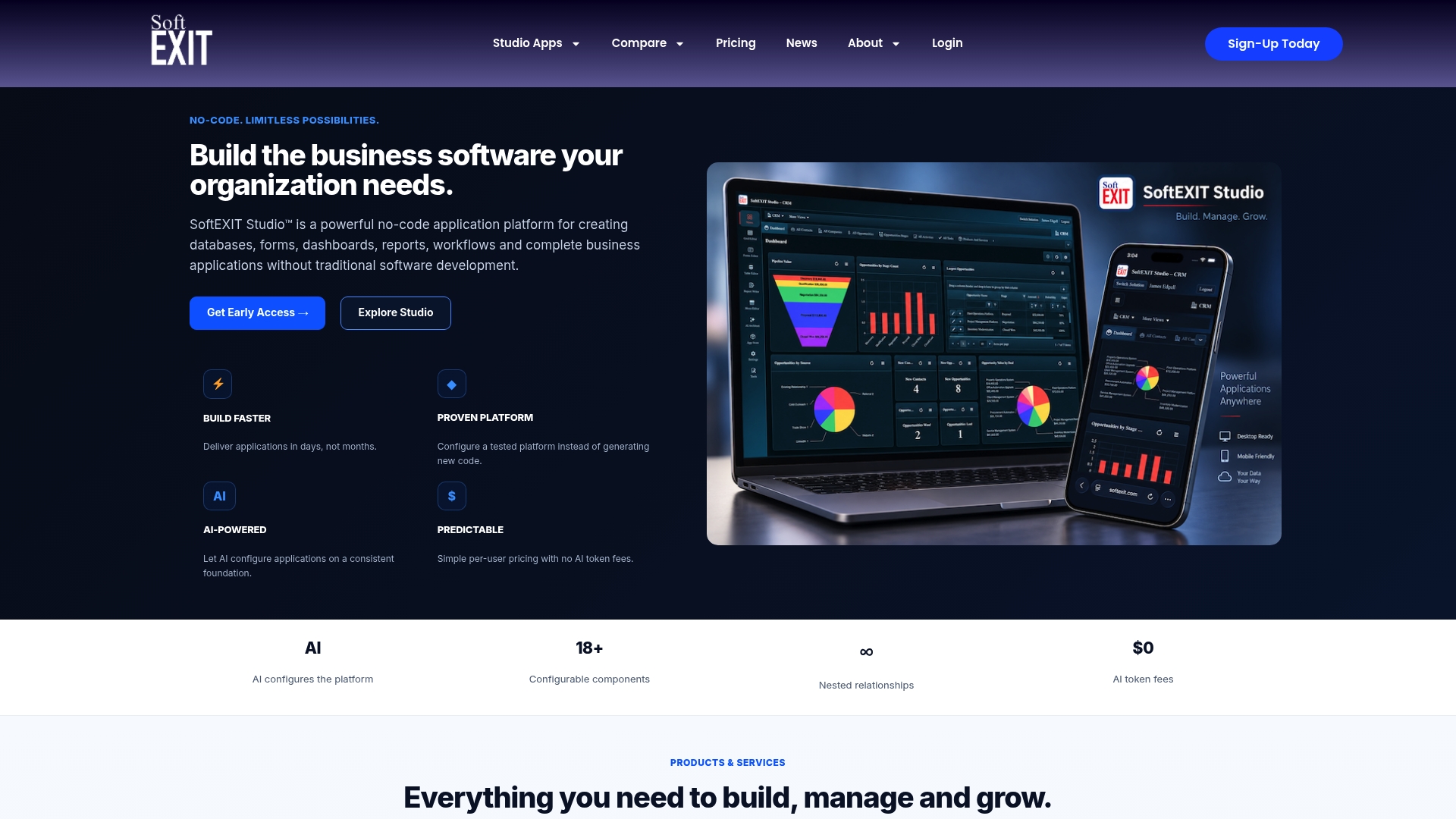
With My Dashboard and My Data, each user opens a view tuned to their own pipeline, opportunities, activities, and tasks, while managers and admins retain visibility into broader organizational data where permissions allow.
- No-code configuration means a sales operations lead, not a developer, can add or adjust widgets.
- AI-assisted setup speeds the initial build of charts, grids, and KPI tiles.
- The platform extends beyond CRM into other operational applications on the same data model when a team’s needs grow.
If you want to see dashboard configuration in action, our SoftEXIT CRM walkthrough covers the setup steps, or you can review plan details to find the right starting point for your team.
FAQ
What are CRM dashboards?
A CRM dashboard is a visual, role-based screen inside a CRM system that shows the KPIs and records a specific user or team needs to track daily, such as pipeline value, open tickets, or quota progress. It differs from a static report because it updates on a schedule or in real time and lets users filter, drill down, and click into the underlying records.
What are the top 3 CRM tools?
There is no single official ranking of CRM tools, since “top” depends on company size, budget, and required features like no-code customization versus deep configuration. Buyers typically compare platforms by criteria such as pricing, ease of setup, and customization depth rather than relying on one universal list.
Is Excel considered a CRM?
Excel can track contacts and deals in a basic way, but it lacks the automation, role-based permissions, and live dashboard interactivity that define a CRM. Most teams outgrow spreadsheets once they need shared pipeline visibility, activity tracking, or dashboards that update without manual copying.
What are the four types of dashboards?
Dashboards are commonly grouped into operational, analytical, strategic, and tactical types, based on the time horizon and depth of analysis they support. A CRM dashboard is typically operational or tactical, built for day-to-day decisions like pipeline follow-up rather than long-range strategic planning.
How much does SoftEXIT CRM cost?
SoftEXIT Studio plans include Starter at $14 per month per user and Professional at $24 per month per user, with Enterprise pricing available on request. SoftEXIT CRM pricing is included within SoftEXIT Studio plans without a separately published price.
Sources
- Free CRM Dashboard Examples and Templates
- KPI dashboard best practices
- Sales Manager Dashboard (SalesforceLabs GitHub)